In the world of financial markets, data analysis is key to success. Tools like the correlation heatmap help investors and traders understand the relationships between assets. The Correlation Heatmap on TradingView is a powerful script that simplifies this process. In this article, we’ll explore what correlation is, how the heatmap works, and how you can use it in your financial strategies.
What Is Correlation?
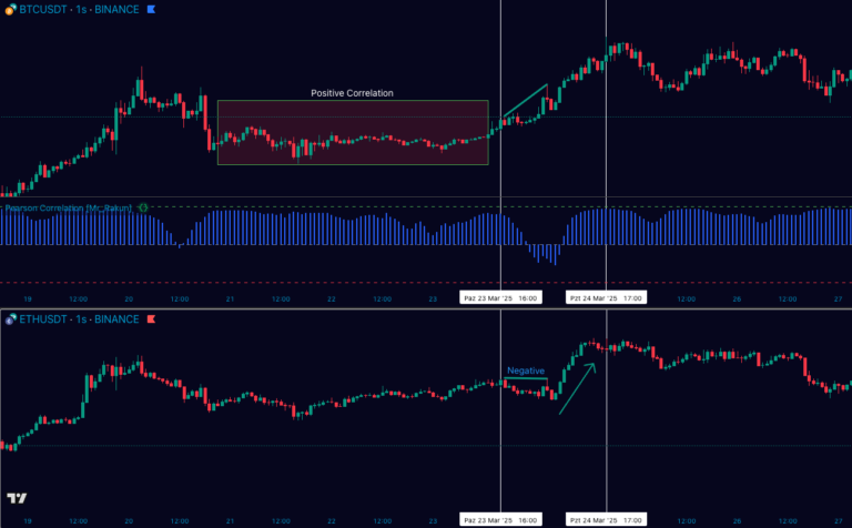
Correlation is a statistical measure that indicates the strength and direction of the relationship between two variables. In finance, it often shows how closely the price movements of two assets align or diverge. The correlation coefficient ranges from -1 to 1:
- 1: Perfect positive correlation (assets move in the same direction).
- 0: No correlation (movements are independent).
- -1: Perfect negative correlation (assets move in opposite directions).
For instance, to explore the relationship between gold and the dollar, you can check additional data on Investing.com.
What Is the TradingView Correlation Heatmap?
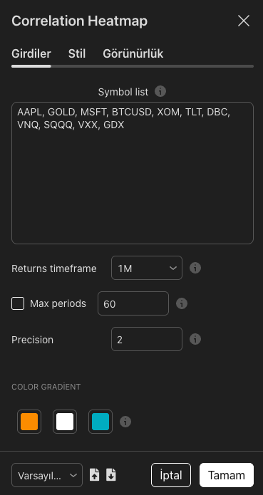
The Correlation Heatmap on TradingView visualizes the correlations between selected financial assets (stocks, cryptocurrencies, forex pairs, etc.) in a color-coded table. Darker colors represent stronger correlations, while lighter shades indicate weaker relationships. With customizable timeframes and symbol options, it’s highly user-friendly. For more details, visit TradingView’s official documentation.
Benefits of Using the Correlation Heatmap
- Portfolio Diversification: Understanding asset relationships helps you spread risk. Investing in highly positively correlated assets might increase exposure unnecessarily.
- Trend AnalyTrend Analysissis: Quickly spot which assets move similarly.
- Strategy Development: Use negatively correlated assets for hedging strategies.
To enhance your market insights, you can compare data from sources like Yahoo Finance.
How to Use It?
To activate the Correlation Heatmap on TradingView:
- Open a chart on the platform.
- Add the “Correlation Heatmap” script from the indicators tab.
- Select the symbols and timeframe you want to analyze.
With these simple steps, you can instantly see how assets relate. Join the TradingView community for more guidance.
Conclusion
The correlation heatmap is a valuable tool for financial analysis. TradingView’s script allows you to quickly and visually assess asset relationships. Whether for correlation analysis, portfolio management, or strategy building, this tool can guide you effectively. Try it today and gain a deeper understanding of market dynamics!